IDEALIST STYLE
  • Blog
  • Overview
  • INSTAGRAM
  • Newsletter
  • Contact
  • ABOUT
  • SUPPORT THE WORK

BEST LIGHT COOL soft LOOKS

13/7/2017

1 Comment

 
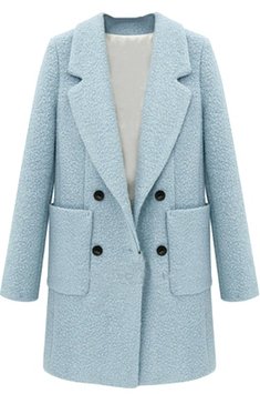
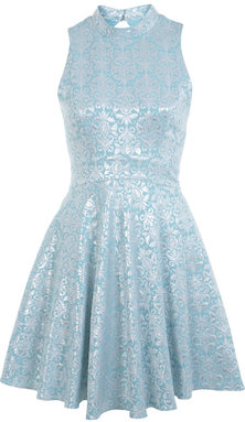
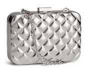
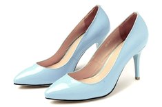
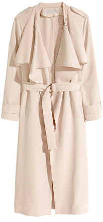
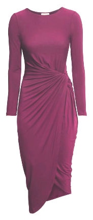
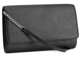
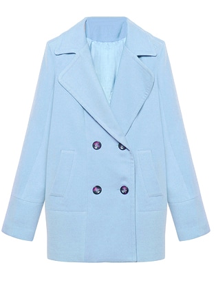
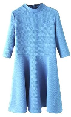
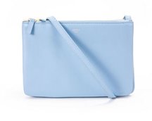
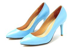
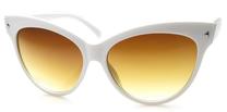
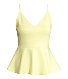
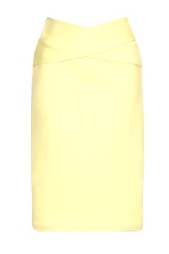
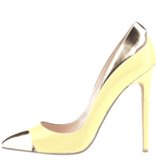
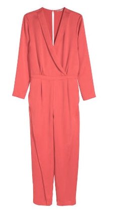
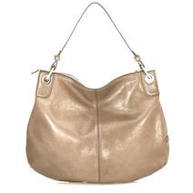
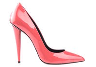
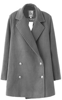
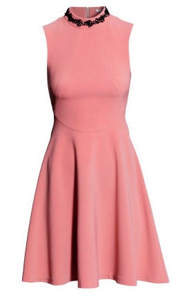
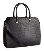
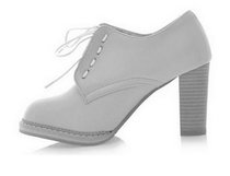
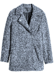
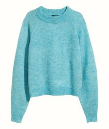
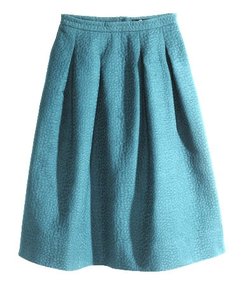
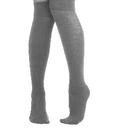
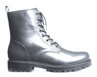
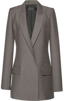
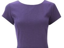
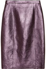
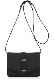
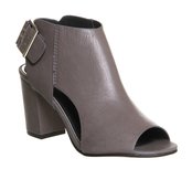
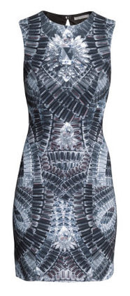
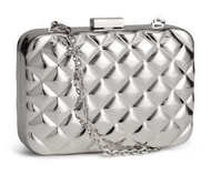
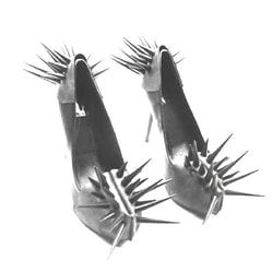
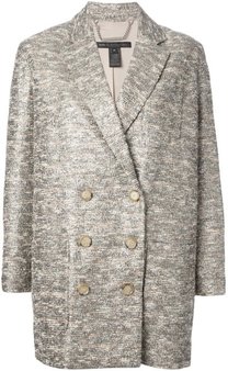
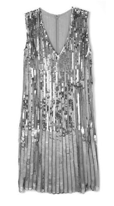
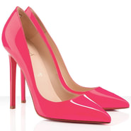
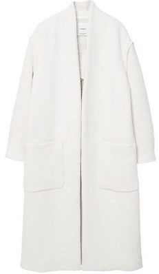
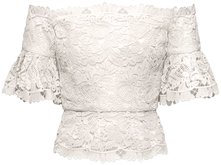
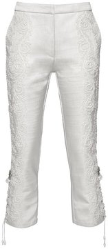
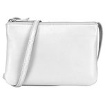
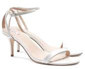
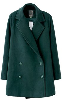
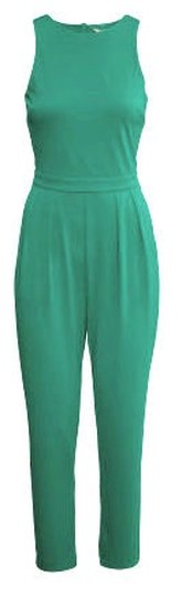
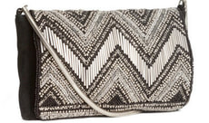
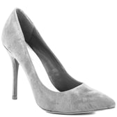
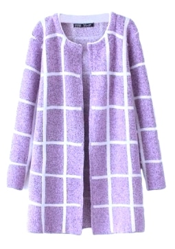
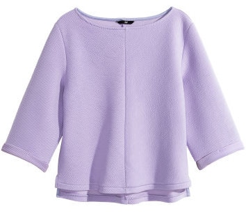
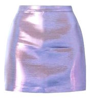
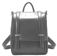
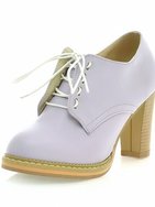
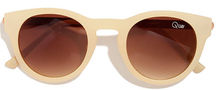
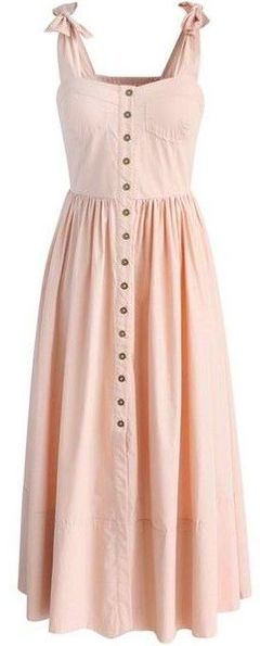
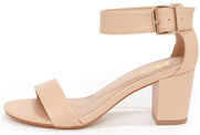
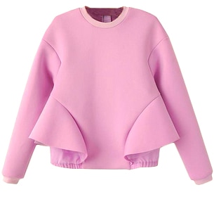
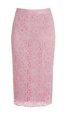
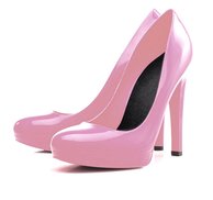
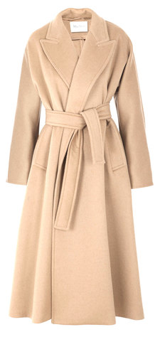
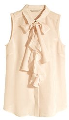
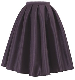
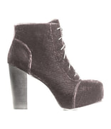
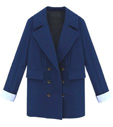
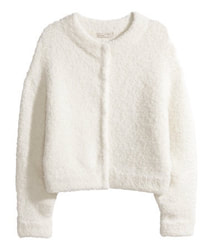
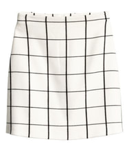
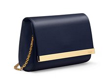
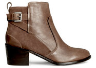
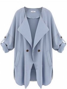
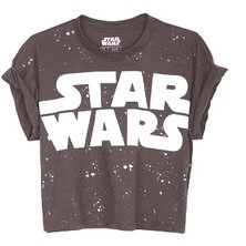
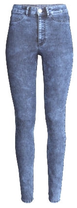
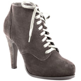
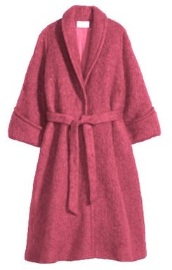
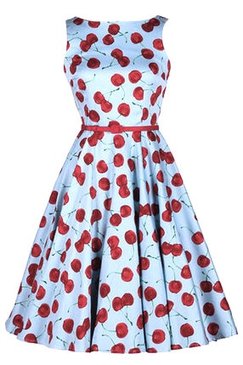
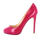
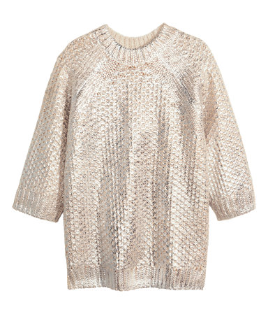
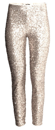
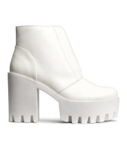
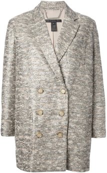
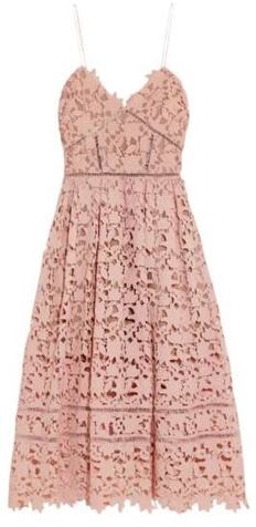
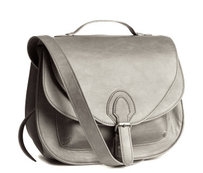
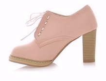
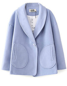
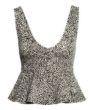
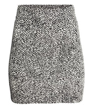
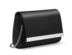
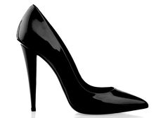
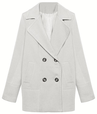
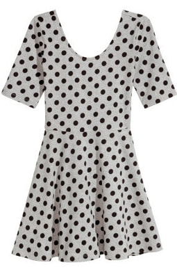
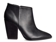
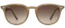
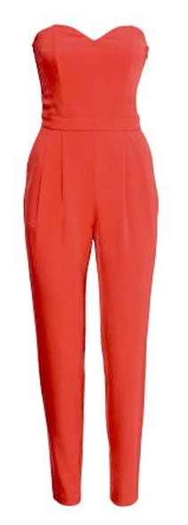
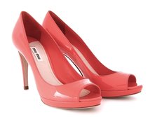
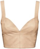
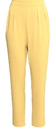
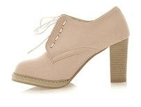
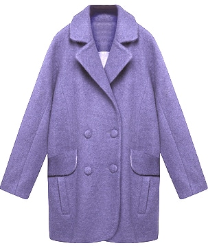
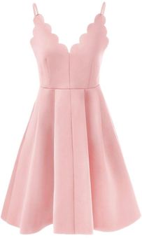
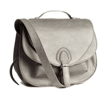
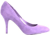
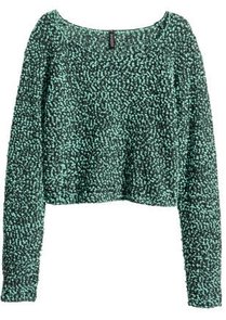
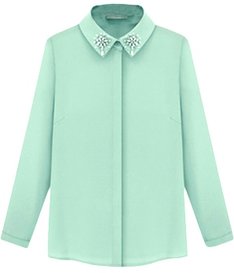
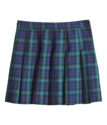
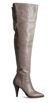
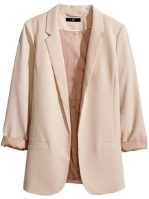
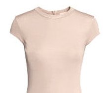
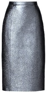
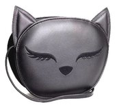
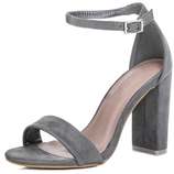
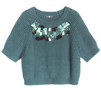
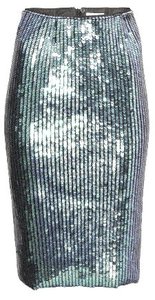
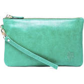
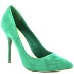
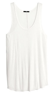
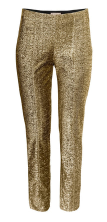
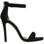
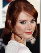
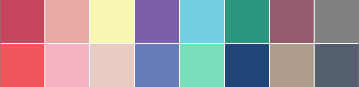
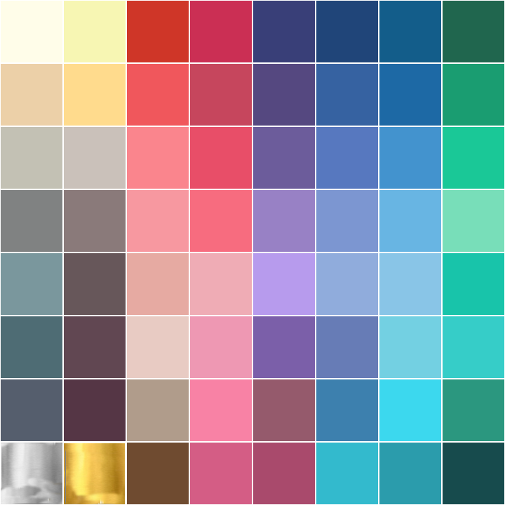
BEST LIGHT COOL soft LOOKS
These outfits have been put together to create a better understanding of how to mix and match colors, contrasts, and materials to get that right look for your appointed group.

Picture
Picture
Picture
Picture
Most shades of cold and light blue will look lovely on this type. You could even say that light and soft blue might be the LIGHT COOL soft's absolute best color. Combined with silver, it gives a icy feel few other than this type can pull off. 

Picture
Picture
Picture
Picture
A pink with a blue undertone looks really great on the LIGHT COOL soft. Combine it with other soft colors to make sure the look doesn't become too saturated. If you must use black, either use makeup to krank up your contrast level, use it on small areas, keep it far from your face, or on accessories. ​The soft has a slightly higher tolerance for the deeper colors, so dark accessories such as these, can work well enough on this type. Dark grey would be better than black though.

Picture
Picture
Picture
Picture
Most shades of cold and light blue will look lovely on this type. Light blue is such a great shade on you, that you need to pick a really wrong shade for it to look bad.

Picture
Picture
Picture
Picture
Chiffon yellow, is the absolute best type of yellow on the LIGHT COOL soft. Also, when accessorizing the LIGHT COOL colors, you want to use a light or soft color, like the soft white and silver in this example. A LIGHT COOL soft looks it's best in soft color combinations. Even a LIGHT COOL color can become a little harsh if combined with a high contrasting color. ​​

Picture
Picture
Picture
This red is what you could call a light red or a soft coral red. It's similar to the tomato-red in the previous outfit, but the difference is that there is a drop of pink in this one which is more true to the a COOL color family. Just make sure the color you pick is the lightened and soft version, not the bold and bright one.

Picture
Picture
Picture
Picture
This soft salmon pink, is another reason why it can be so difficult to separate LIGHT COOL and LIGHT WARM colors. Because they do actually share a lot of colors with only slight differences to set them apart.

Picture
Picture
Picture
Picture
Picture
Both cold grey and soft teal are great shades on the LIGHT COOL soft.

Picture
Picture
Picture
Picture
Picture
This purple, taupe/grey-brown look with a black purse, is a good way to do a dark toned look on the LIGHT COOL soft. The many toned look softens the contrast between the shades, and makes it look less harsh (even the black). 

Picture
Picture
Picture
If you like an edgy look, it's best to do one in your own best colors. You don't need to go all black to be edgy.
Pick an edgy shape or material in a LIGHT COOL color, and it will look a lot more natural on you.

Picture
Picture
Picture
Silver is your best metallic.
Picture
Picture
Picture
Picture
Picture
Soft white is an incredible color on the delicate and light toned LIGHT COOL soft. The low contrast level and fair skin makes them perfect for this snow queen look. ​

Picture
Picture
Picture
Picture
Bright shades of green can also be a good look on the LIGHT COOL. Just pay extra attention to these particular shades, as they're not as saturated as they may appear. They have a blue undertone and has been softened, which means that these colors have been lightened to fit this group. Stronger looking colors such as these are best accessorized by using light and neutral tones, for a low contrast look.

Picture
Picture
Picture
Picture
Picture
Purple is another amazing color on the LIGHT COOL soft. Just make sure the shade is not too bold, but rather has a lightness and a softness to it.

Picture
Picture
Picture
The LIGHT COOL soft, just can't go wrong with a light ballerina pink or a soft and light blush. These colors brings out the absolute best in this type. The LIGHT COOL can actually pull of "baby" colors without it coming off as a childish look.


Picture
Picture
Picture
Light and soft shades of neutral and cool toned pink, are really great colors for this delicate, low contrast group.

Picture
Picture
Picture
Picture
Nude, beige, greige, grey, stone, taupe, and all these soft neutral colors, are all great looks for the LIGHT COOL soft. They are also your best colors for accessorizing a dark colored look such as this purple-brown skirt, as it will help soften the overall impression and keep it light.

Picture
Picture
Picture
Picture
Picture
Another great way of pulling of a "black and white" look, is to switch it around and go for a "white with black" look. For this to work, the soft white should dominate the look and the black print has to be gentle. Combine it with a neutral tone for a soft look.

Picture
Picture
Picture
Picture
As any good little summer group, a LIGHT COOL true has to look good in grey-ish shades of brown. If you want a casual and neutral toned look for every day use or basics, grey-brown, taupe, grey, stone, navy blue, soft white, nude, beige, greige, jeans blue, and so on, are your colors. Black is best left to days when you can do a full face of makeup.

Picture
Picture
Picture
Another type of red for this group, is the more pink toned red with a blue undetone. This one is more true to the cold color family, but since the LIGHT COOL soft is not purely cold, they can do both. As I've mentioned before, combine a saturated, bold look with either neutral colors or another light tone to keep it LIGHT. ​

Picture
Picture
Picture
Silver, platinum, white gold, and a silver and gold mix are the best metallics for the LIGHT COOL soft. Silver is your absolute best metallic, but these others are a close second.
Picture
Picture
Picture
Picture
Soft shades of pink, such as blush is a really great color for this delicate group. Combined with grey, it's the ulitimate soft look.

Picture
Picture
Picture
Picture
Picture
If you want to wear black and white patterns, this is the best way to do so. The small print appears a lot softer and actually comes off as grey. It's technically a little "color cheating", but that's how you do your version of what's traditionally more of a bold and CLEAR look, using LIGHT COOL colors. ​​Patterns and color blocking is best done either monochromatic, all light colors, or pairing dark and bright with soft and light. ​


Picture
Picture
Picture
Picture
Icy grey is a great example of a neutral and striking look for the LIGHT COOL soft. Grey is the LIGHT COOL's version of black and great for basics and accessories, as it brings out this sub-groups delicate and light features. ​This is also a great example of a "soft and delicate" print. You don't want your prints and patterns to overpower your low contrast level.

Picture
Picture
Picture
Because the LIGHT COOL is flowing into the LIGHT WARM, it's not as cold as the other cold toned groups. This makes this type of light tomato-red, look surprisingly fresh on the LIGHT COOL soft. It will still look a bit more orange on a LIGHT COOL than it would on a LIGHT WARM, but it's still a very pretty look. Just make sure the tomato-red you pick is the lightened, soft and fresh version, not the bold, dirty, and fiery version.

Picture
Picture
Picture
This soft golden yellow, is part of the reason why it can be so difficult to separate the LIGHT COOL from the LIGHT WARM. Because they do actually share a lot of colors with only slight differences to set them apart. If you pay really close attention there are differences, but just not very easy to notice.

Picture
Picture
Picture
Picture
This "baby colored" outfit, would look really childish on most of the other color types. However, on the LIGHT COOL, it just looks too good not do it. It comes off as fresh and flattering instead. 

Picture
Picture
Picture
Picture
Mint green with a blue undertone is a LIGHT COOL color, but the "soft" has to make sure the look doesn't get too saturated by adding some softer colors.

Picture
Picture
Picture
Picture
Picture
If you must use black, either use makeup to cranck up your contrast level, use it on small areas, keep it far from your face, or on accessories. ​Or do all of the above, and combine the look with a great light and soft color such as nude, to lighten the overall look.

Picture
Picture
Picture
Picture
This color is a grey-green with blue undertones, similar to the qualities of the color stone. It's a great "dark" color on the LIGHT COOL soft, as it comes of deep and rich without actually being very dark and saturated. It also has that cold toned look that makes it brilliant as a metallic, for a frosty vibe. Also a great color for combining with other LIGHT COOL shades.

Picture
Picture
Picture
Gold and rose-gold can also look pretty good on the LIGHT COOL soft, because of it's LIGHT WARM sister-group, as well as flowing into the SOFT COOL. Since gold and silver are neutral tones, gold will still work pretty well even though this group is more cold than warm. 

Picture
Picture
Picture
Picture
Picture
Picture
Picture
Picture
Picture
Picture
Picture

DETERMINE YOUR COLOR GROUP

(Photos in this post are borrowed from HM.COM, Jollychic.com, and a few are random pictures from Tumbler or Pinterest or found on Google. Unknown source.)
1 Comment
kodi.software link
25/2/2022 04:19:44 am

nks for sharing the article, and more importantly, your personal experience mindfully using our emotions as data about our inner state and kn ascowing when it’s better to de-escalate by taking a time out are great tools. Appreciate you reading and sharing your story since I can certainly sxcac. asxcaSCrelate and I think others can to
z

Reply


Leave a Reply.

    ETHICAL AND PERSONALIZED STYLE, FOR A "GOOD FOR YOU" WARDROBE.

    Idealist style is a website and "slow blog" dedicated to ethical fashion and personalized style, including tips on how to find your very own "slow fashion" style by using color analysis, the body types system, and other slow fashion tips.»
    Created by an idealistic fashion designer, stylist, writer, and illustrator with a passion for "good for you" fashion. 
    Very nerdy about it. 
    Born in Norway, educated in Milan, Italy.


    I decided to name my page "Idealist Style", because I'm an idealist. On both a creative. environmental, and a humanitarian level. So, I feel the title suits my message well. 
    i·de·al·ism 
    -The act or practice of envisioning things in an ideal form. 
    -Artist who treats subjects imaginatively. 
    -Belief in or pursuit of one's ideals, of high or noble principles, purposes, or goals. 

    The work on this site is mine unless specified. 

    Archives

    January 2020
    November 2018
    October 2018
    September 2018
    July 2018
    June 2018
    May 2018
    December 2017
    November 2017
    October 2017
    September 2017
    August 2017
    July 2017
    June 2017
    April 2017
    March 2017
    February 2017
    January 2017
    December 2016
    November 2016
    October 2016
    September 2016
    August 2016
    July 2016
    June 2016
    May 2016
    March 2016
    February 2016
    December 2015
    October 2015
    August 2015
    June 2015
    May 2015
    April 2015
    March 2015
    February 2015
    January 2015
    December 2014
    November 2014
    October 2014
    September 2014
    July 2014
    May 2014
    April 2014
    March 2014
    February 2014
    January 2014
    December 2013
    November 2013
    October 2013
    September 2013
    August 2013
    July 2013
    June 2013

    RSS Feed

Proudly powered by Weebly
  • Blog
  • Overview
  • INSTAGRAM
  • Newsletter
  • Contact
  • ABOUT
  • SUPPORT THE WORK